Bubble-grid-maps
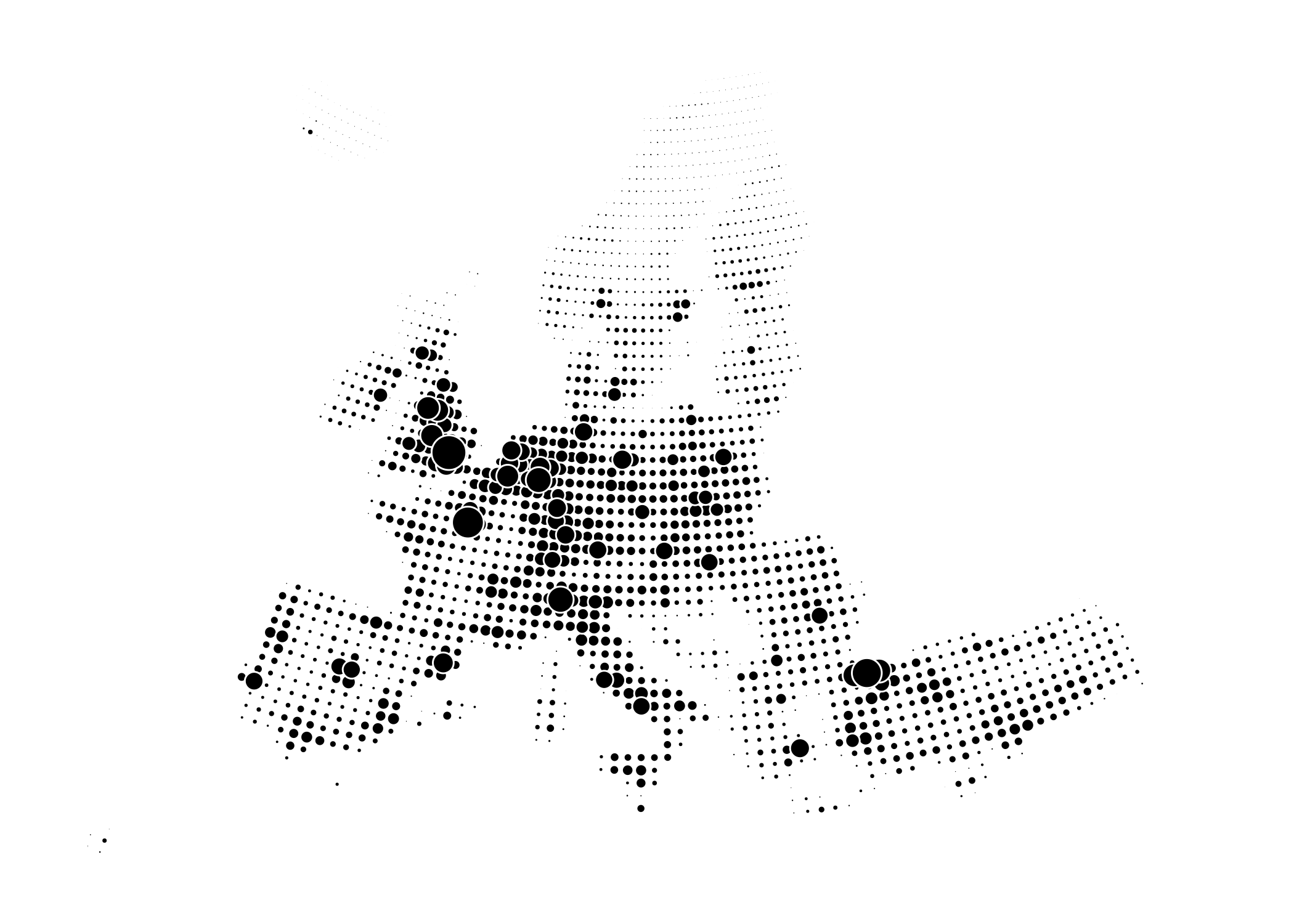
Gridded population numbers in Europe 2017. Bubble area scaled to absolute population number. Data: Eurostat (demo_r_pjanaggr3)
Update 2018-07-31: I’ve unintentionally used a non-equal-area grid when creating these bubble-grid maps. Here’s how to avoid that mistake and create an equal-area grid
I want to show the population density across Europe in a stylized fashion using a regular grid of bubbles sized according to population counts. Using circle-area instead of color as visual encoding I hope to achieve a more direct depiction of magnitude differences compared to a choropleth map. But really, I’m just messing around with R, the eurostat and sf packages. Let’s do a bubble-grid-map™©.
First I download population counts eurostat::get_eurostat() and regional geodata eurostat::get_eurostat_geospatial() then I divide the geographical surface into a regular grid of cells sf::st_make_grid(). Next, I merge population data and geographic data dplyr::left_join() and calculate the area-weighted average population count under each grid cell sf::st_interpolate_aw(). After grabbing the centroid coordinates of each cell sf::st_centroid() and converting them to numeric columns sf::st_coordinates() I’m ready to plot the results with ggplot. Mind you that I’m using simple ggplot2::geom_point() instead of the new ggplot2::geom_sf() as the latter has severe performance issues when drawing points (see here.)
How about a bubble-grid-map showing the absolute population change in each grid cell over a five year period?
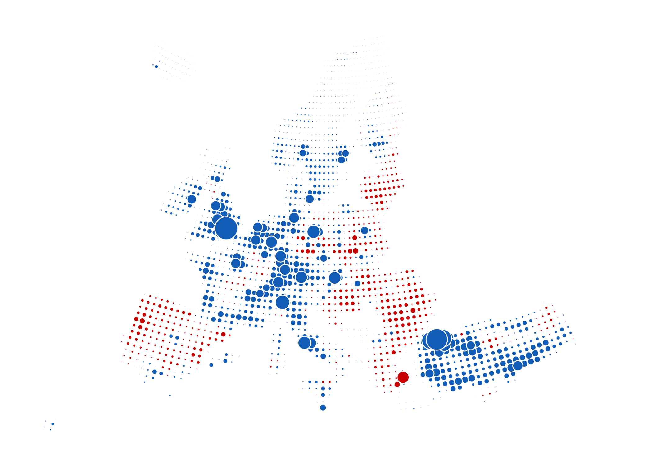
Gridded population change 2012 to 2017 in Europe. Growing regions are blue, shrinking regions red. Bubble area scaled to absolute change in numbers. Data: Eurostat (demo_r_pjanaggr3).
cc-by Jonas Schöley