Bubble-grid versus choropleth maps
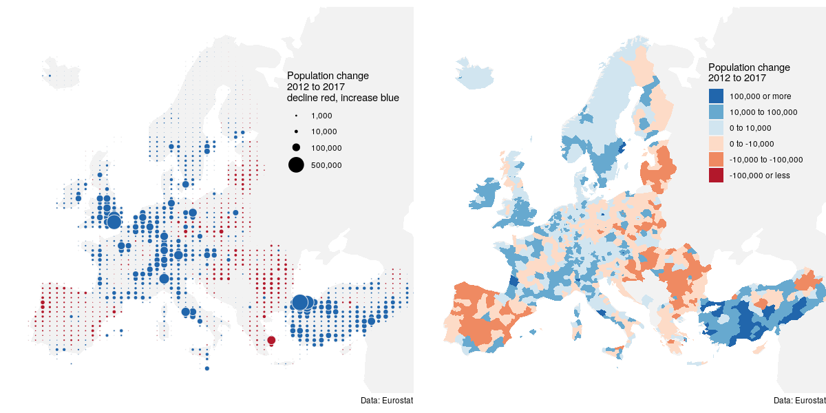
Bubble-grid map versus choropleth map of population change in Europe 2012 to 2017. Data: Eurostat (demo_r_pjanaggr3)
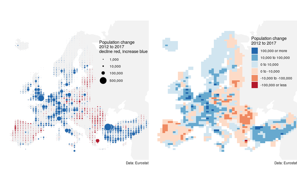
Update 2018-07-31, A fairer comparison: Bubble-grid vs. Choro-grid.
One of the things that strike me when reading Jacques Bertin’s Semiology of Graphics are the demonstrations of how different the same data can look when mapped in different styles. This connects directly to the realization by Cleveland and others that not all visual channels are equally fit for the same task.
Bertin’s work continues to inspire me to try out alternative visual mappings. The bubble-grid idea is such an experiment in perception. While color as used in choropleth maps is a great way to show spacial patterns, its hard to get a feeling for the relative magnitudes of the depicted quantities from color alone. Area however is a more effective magnitude encoding. So why not show magnitudes on a map via the size of a symbol? However, if we draw a single symbol for each statistical region we will have dense clusters of symbols wherever regions are small, and sparse symbols wherever they are large – visually this will confound region area with whatever attribute we wish to visualize. This problem is solved by spatially interpolating the attribute of interest over a regular grid and drawing a scaled bubble at the centroid of each grid cell.
Is the bubble-grid map a good alternative to the choropleth map? I believe that magnitude differences are clearer with the bubble-map in this particular example. But I’m not sure how well it generalizes. Keep on experimenting!
cc-by Jonas Schöley