The Unknown Pleasures of Demography
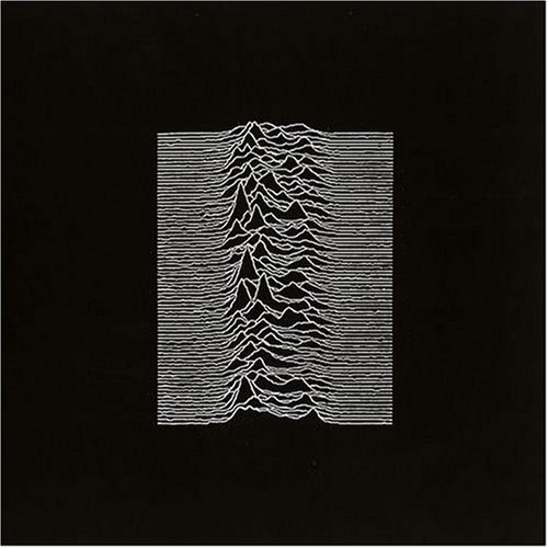
Did you know that the cover of Joy Divisions classic “Unknown Pleasures” shows the radio frequency spectrum of the first discovered pulsar over time? I always loved this visualization. It’s a poor man’s perspective plot but because of its limitations full of charm. Also, unlike true 3D plots it does not feature visual compression towards a vanishing point. Each line is just offset by some value along the y-axis but not otherwise rescaled, i.e. differences in magnitude don’t appear more striking in the foreground and get squished towards the “horizon”, they remain constant.
And who’s to say the human age-distribution of death isn’t as interesting as cosmic pulsars? Let me show you the unknown pleasures of demography. For the fist examples we download the density of deaths over age by period for Russia from the Human Mortality Database. You need to register to download data – don’t worry its a short and painless affair.
library(HMDHFDplus)
lt <- readHMDweb(CNTRY = "RUS", item = "bltper_1x1",
                 username = "***", password = "***")
Below you find a small function taking in three vectors and spitting out superimposed curves Joy Division Style. You can even change viewing direction and angle…
MakeJoy <- function(x, y, z, angle = 1, reverse = FALSE) {
  require(ggplot2)
  Normalize <- function (x) {(x-min(x))/(max(x)-min(x))}
  df = data.frame(x = x, y = Normalize(y), z = z)
  p <- ggplot(NULL, aes(x = x, y = y+z/angle)) +
    theme_void() +
    theme(plot.background = element_rect(fill = "black"), aspect.ratio = 1,
          text = element_text(colour = "grey"))
  for (i in sort(unique(df$y), decreasing = reverse)) {
    dat = df[df$y == i, ]; dat$z = Normalize(dat$z)
    if (identical(reverse, FALSE)) { dat$y = -dat$y }
    dat0 = rbind(data.frame(x = min(dat$x), y = dat$y[1], z = 0), dat)
    dat0 = rbind(dat0, data.frame(x = max(dat$x), y = dat$y[1], z = 0))
    p <- p +
      geom_polygon(color = NA, fill = "black", show.legend = FALSE, data = dat0) +
      geom_line(color = "white", data = dat)
  }
  return(p)
}

MakeJoy(x = lt$Age, y = lt$Year, z = lt$dx)
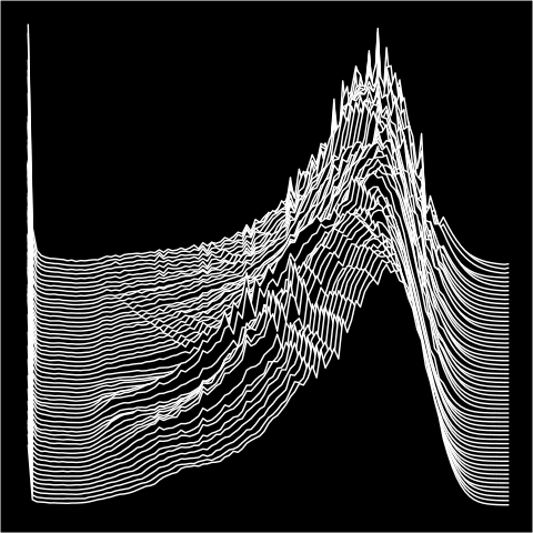
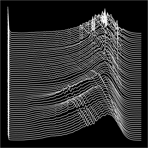
The angle argument changes a global scaling factor which is the same for all the lines and simulates the effect of a pseudo-perspective change.
MakeJoy(x = lt$Age, y = lt$Year, z = lt$dx, angle = 4)
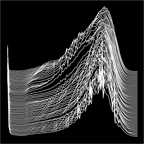
We can also look at the plot from the opposite side.
MakeJoy(x = lt$Age, y = lt$Year, z = lt$dx, reverse = TRUE)
What are we actually looking at? A series of filled polygons occluding each other.
MakeJoy(x = lt$Age, y = lt$Year, z = lt$dx) + theme_classic()
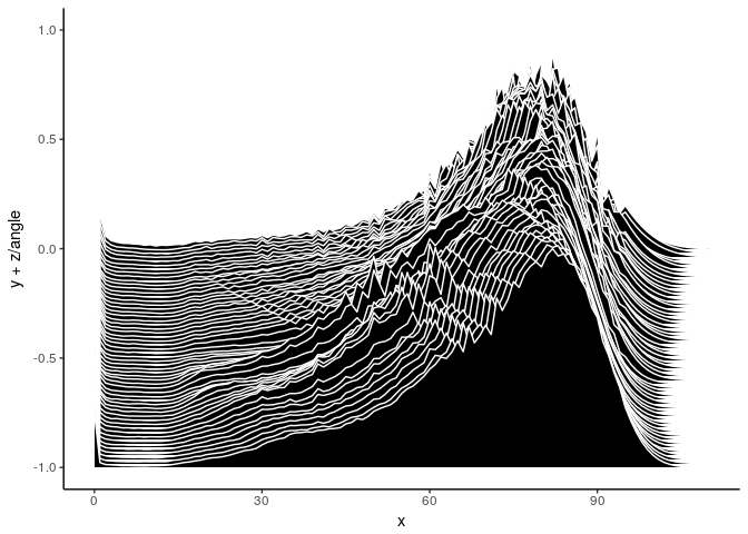
Using lines as primary visual encoding allows us to see small details in the data such as cohort artefacts…
…age-heaping…

…smooting…

Let’s get serious…
library(tidyverse)
library(gridExtra)
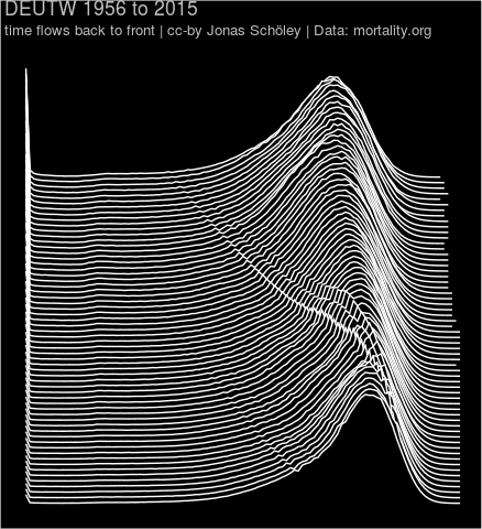
walk(getHMDcountries(), function (x) {
lt <- readHMDweb(CNTRY = x, item = "bltper_1x1",
username = "***", password = "***")
lt <- filter(lt, dx != 0)
pl <- MakeJoy(x = lt$Age, y = lt$Year, z = lt$dx, angle = 3) +
ggtitle(paste(x, min(lt$Year), "to", max(lt$Year)),
subtitle = "time flows back to front | cc-by Jonas Schöley | Data: mortality.org")
print(pl)
})
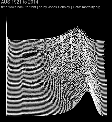 Age-distribution of death over time Australia
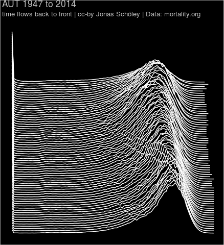 Age-distribution of death over time Austria
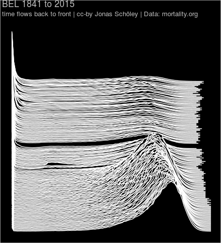 Age-distribution of death over time Belgium
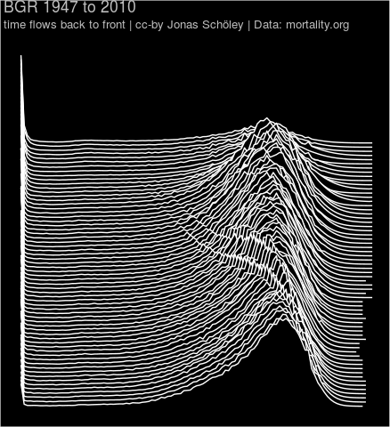 Age-distribution of death over time Bulgaria
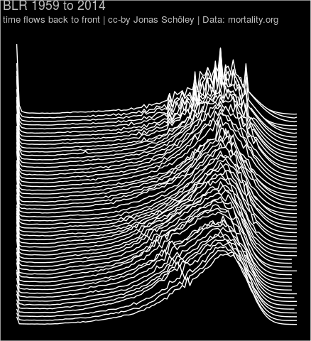 Age-distribution of death over time Belarus
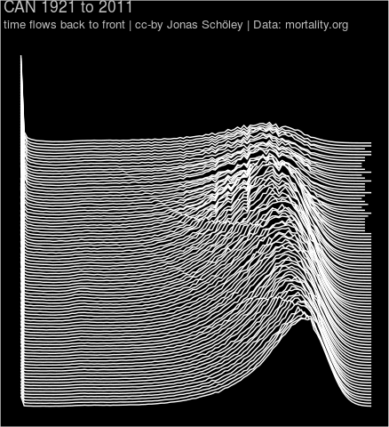 Age-distribution of death over time Canada
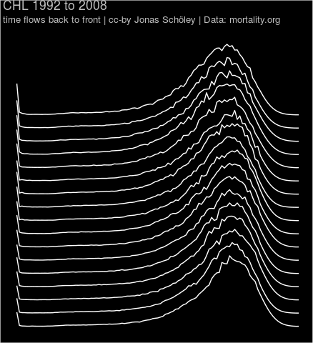 Age-distribution of death over time Chile
 Age-distribution of death over time Croatia
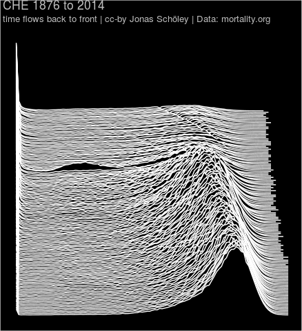 Age-distribution of death over time Switzerland
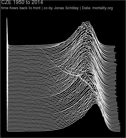 Age-distribution of death over time Czech Republic
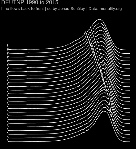 Age-distribution of death over time Germany (east & west)
 Age-distribution of death over time Germany (east)
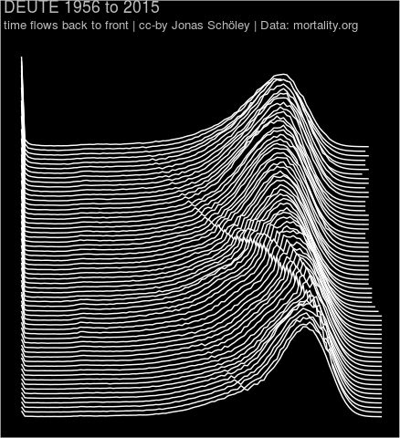
 Age-distribution of death over time Germany (west)
 Age-distribution of death over time Denmark
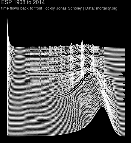 Age-distribution of death over time Spain
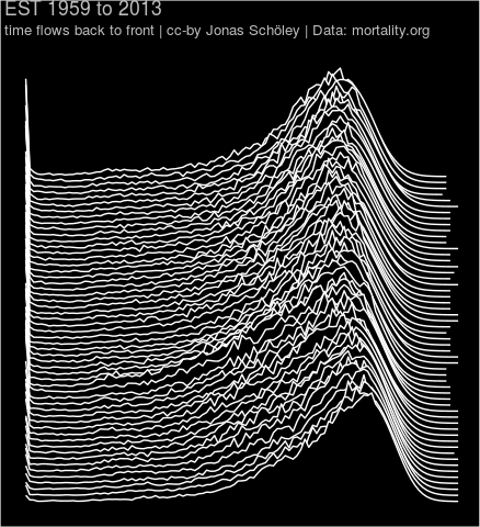 Age-distribution of death over time Estonia
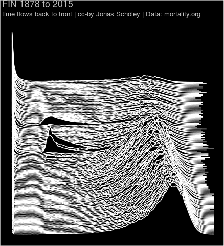 Age-distribution of death over time Finland
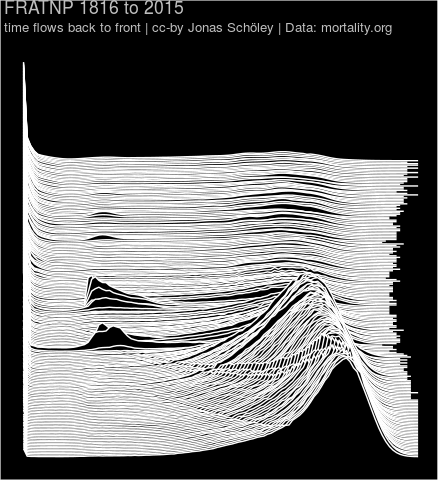 Age-distribution of death over time France (total population)
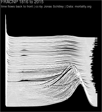 Age-distribution of death over time France (civilian population)
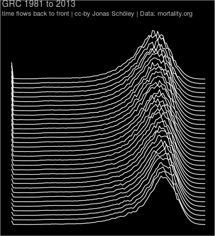 Age-distribution of death over time Greece
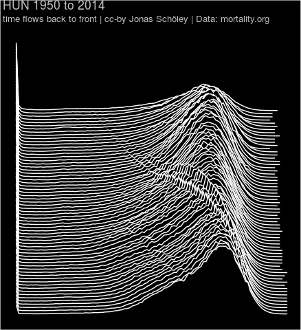 Age-distribution of death over time Hungary
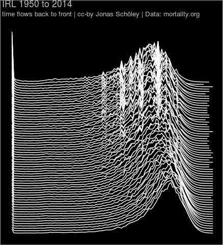 Age-distribution of death over time Ireland
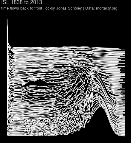 Age-distribution of death over time Iceland
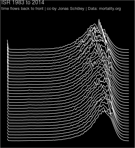 Age-distribution of death over time Israel
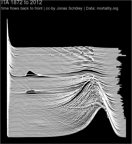 Age-distribution of death over time Italy
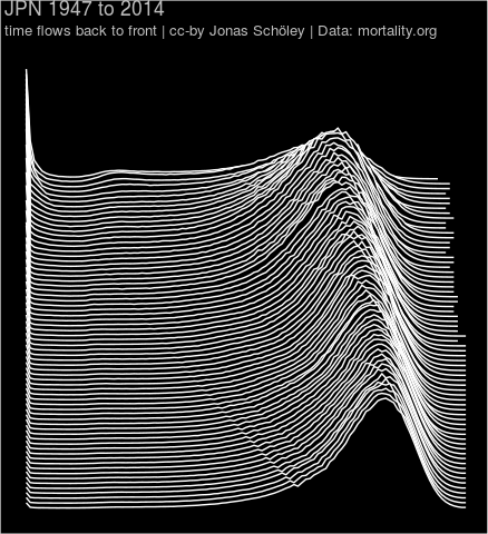 Age-distribution of death over time Japan
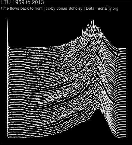 Age-distribution of death over time Lithuania
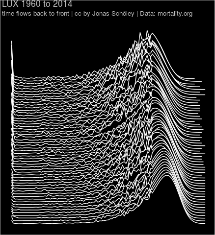 Age-distribution of death over time Luxembourg
 Age-distribution of death over time Latvia
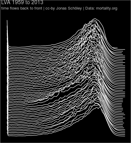
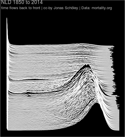 Age-distribution of death over time Netherlands
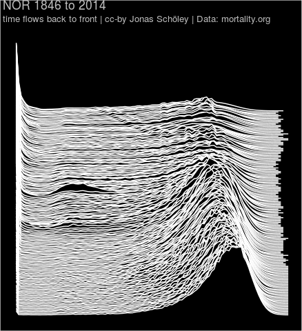 Age-distribution of death over time Norway
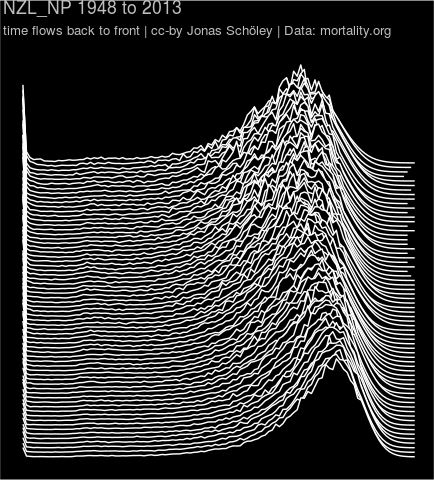 Age-distribution of death over time New Zealand (total population)
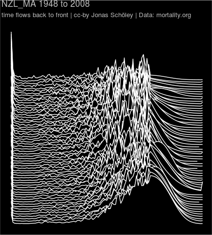 Age-distribution of death over time New Zealand (Maori population)
 Age-distribution of death over time New Zealand (non-Maori population)
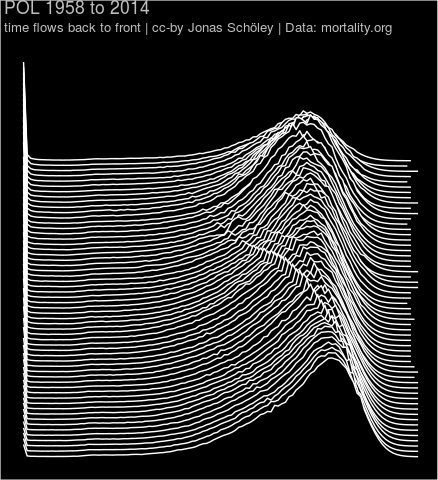 Age-distribution of death over time Poland
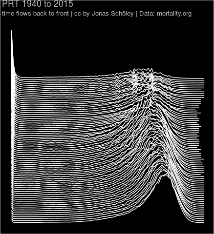 Age-distribution of death over time Portugal
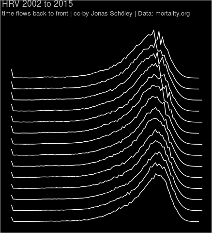
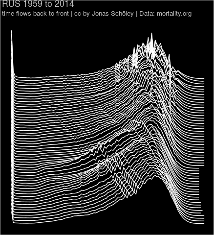 Age-distribution of death over time Russia
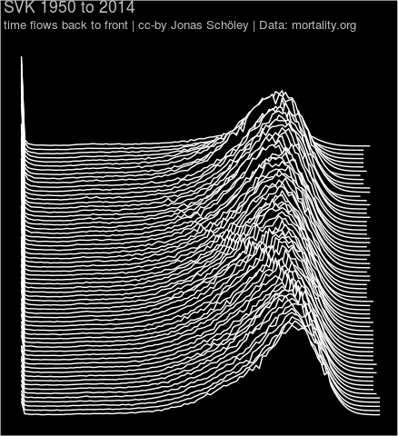 Age-distribution of death over time Slovakia
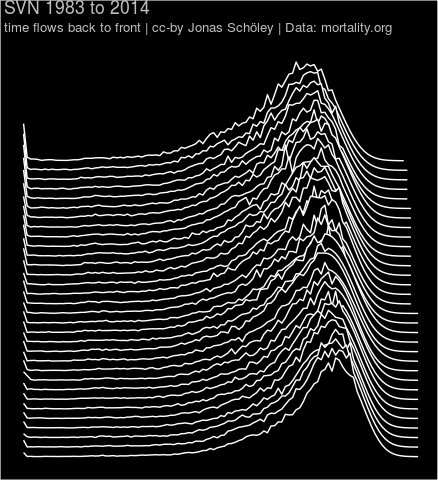 Age-distribution of death over time Slovenia
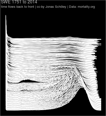 Age-distribution of death over time Sweden
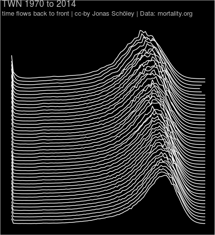 Age-distribution of death over time Taiwan
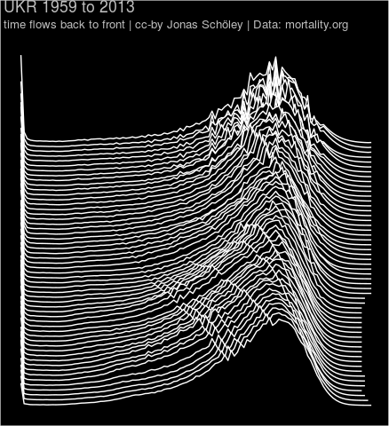 Age-distribution of death over time Ukraine
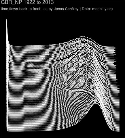 Age-distribution of death over time Great Britain (total population)
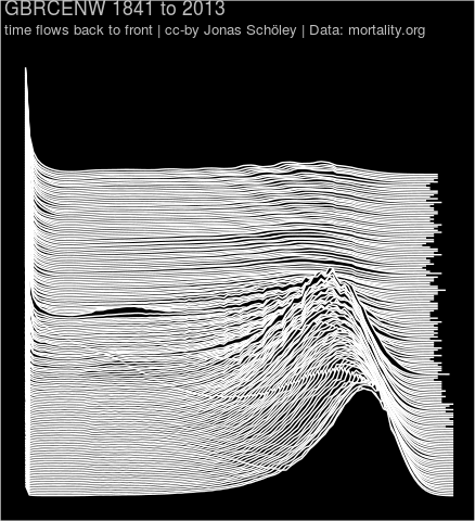
 Age-distribution of death over time England & Wales
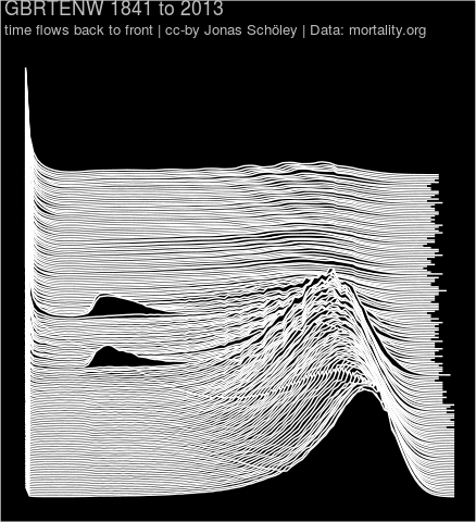
 Age-distribution of death over time England & Wales (civilian population)
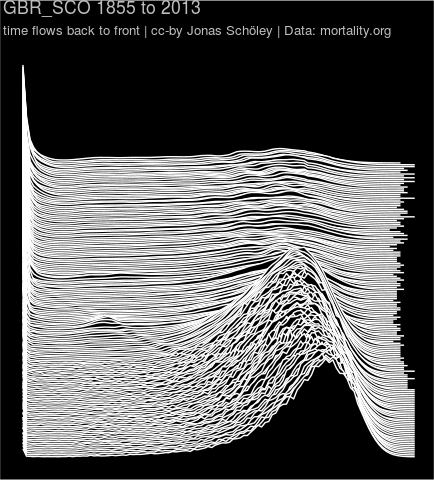 Age-distribution of death over time Scotland
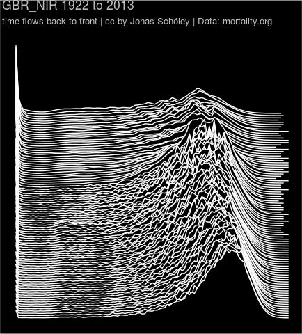 Age-distribution of death over time Northern Ireland
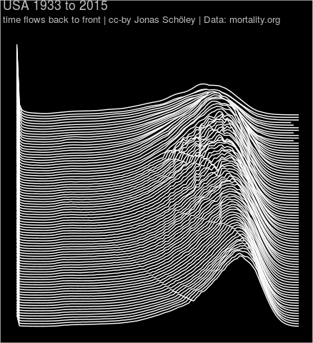 Age-distribution of death over time United States